Commercial Design Trends We're Watching for in 2025

As we enter 2025, businesses and organizations increasingly recognize the importance of design in shaping how people experience their spaces.
From creating welcoming atmospheres to reflecting brand identity, the right design choices are essential. Among these choices, paint colors and finishes are some of the most versatile tools to bring trends to life.
Whether you're revamping an office, a church, a restaurant, a school, or a retail space, understanding the latest commercial design trends can help you create an environment that feels fresh, modern, and engaging.
Office Buildings: Where Productivity Meets Style
Office design continues to evolve, blending functionality with aesthetics to foster productivity and creativity.
- Sustainable Neutrals: In 2025, earthy tones like clay, sand, and olive will make waves. These colors create a calm, grounded atmosphere and tie into the growing focus on sustainability and environmental consciousness.
- Biophilic Influences: Nature-inspired shades, such as sage green and sky blue, are a simple yet effective way to bring the outdoors in, promoting wellness and reducing stress.
- Contrasting Accent Walls: Bold, high-contrast colors like deep navy or fiery orange are a strategic choice to define collaborative zones and energize employees.
These office design trends emphasize balance—creating spaces that feel both professional and inviting.
Places of Worship: Honoring Tradition While Embracing Modernity
Churches are unique in their design needs, often blending sacred tradition with a desire to remain relevant in today's world.
- Heritage-Inspired Palettes: Deep blues, golds, and soft whites are timeless choices that honor these spaces' rich history.
- Subtle Metallic Finishes: Gold or silver accents on ceilings, moldings, or focal areas like altars can elevate the space without overwhelming its serene atmosphere.
- Warm, Inviting Hues: Colors like terracotta and cream are increasingly popular for creating a sense of warmth and community.
Churches can maintain their historical charm by combining traditional and contemporary elements while appealing to modern congregations.

Restaurants: Setting the Stage for Memorable Dining Experiences
In a highly competitive restaurant industry, design is key to creating ambiance and enhancing the customer experience (which can help keep your establishment at the top of the food chain).
- Bold and Edgy Colors: Jewel tones like emerald green, sapphire blue, and amethyst purple make a statement; pairing these choices with dramatic blacks or charcoals will help enhance the jewel tones while complimenting the entire room.
- Food-Inspired Hues: Shades reminiscent of culinary ingredients—think paprika, saffron, and basil—add subtle thematic connections to the dining experience (which could encourage patrons to order an extra appetizer or drink).
- Texture Play: Faux finishes and textured paints, such as stucco or brushed metallics, bring depth and uniqueness to walls and ceilings, enhancing the establishment's overall ambiance.
These choices help restaurants craft a memorable environment that keeps diners coming back.
Schools & Education Centers: Inspiring Young Minds Through Color
Schools are embracing thoughtful design to create environments conducive to learning and creativity.
- Playful Yet Focused: Bright, uplifting colors like yellow and teal energize common areas, while softer tones like pastel greens and blues help maintain classroom focus.
- Zoning Through Color: Using color to delineate different areas, such as libraries, cafeterias, and recreational spaces, enhances functionality and creates visual interest.
- Durable, Easy-to-Maintain Coatings: Vibrant yet highly durable paints are essential for high-traffic areas, ensuring that spaces remain fresh and inviting despite heavy use (as well as allowing for easier cleanup).
School color choices can directly impact student engagement and morale, making them an essential design consideration.
Retailers: Aligning Design with Brand Identity
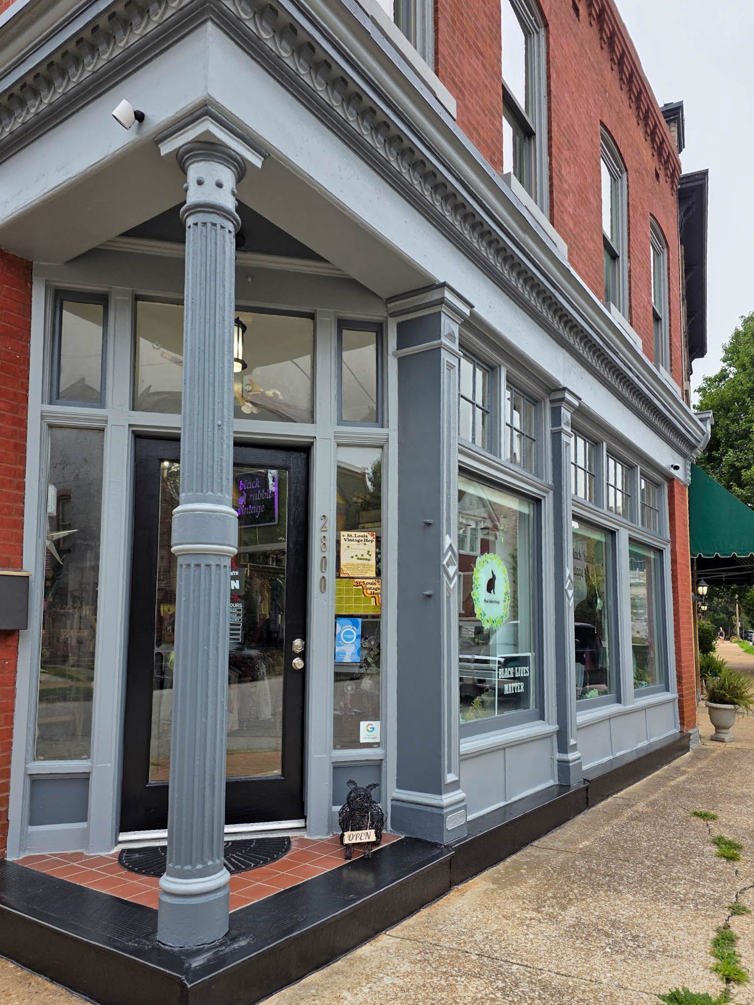
In retail, first impressions matter. Design trends for 2025 focus on creating captivating and brand-aligned spaces that draw customers in.
- Brand-Focused Palettes: Incorporating colors that reflect a brand's identity helps create a cohesive and memorable shopping experience.
- Monochrome with Pops of Color: Minimalistic base shades like whites or greys paired with bold highlights for product displays are a hit, offering versatility and modernity.
- Seasonal Adaptability: Neutral tones allow retailers to easily switch accent colors for different seasons or promotional campaigns, keeping spaces fresh and relevant.
These strategies ensure that retail spaces look good and drive customer engagement and sales.
Additional Emerging Paint Trends In Commercial Spaces
Specific trends are universal and enhance the appeal of any commercial building. While we've seen the following design choices slowly gain traction over 2024, industry experts believe they are poised to take center stage this year.
- Matte and Satin Finishes: These finishes are gaining popularity for their sleek, modern appearance and ability to hide imperfections.
- Eco-Friendly Paints: With sustainability at the forefront, low-VOC and environmentally friendly paints are becoming standard choices.
- Geometric Patterns and Murals: Custom wall designs, from geometric shapes to artistic murals, add personality and visual interest to spaces.
These overarching trends offer endless possibilities for tailoring designs to specific needs and preferences.

Work With SmithPro Commercial Painting
As 2025 unfolds, the design trends shaping commercial spaces reflect a blend of aesthetics, functionality, and sustainability.
Whatever projects you have in mind for 2025, keeping trends in mind ensures your building remains enjoyable for its occupants and visitors.
With years of experience in commercial painting, our team is here to help bring your vision to life.
Contact us today to discuss your commercial painting projects for 2025 and beyond!