Color Theory Essentials for Commercial Painting Projects

When planning a commercial painting project, color is often one of the last decisions made, yet it's one of the most impactful.
The colors you choose for your building's interior and exterior influence how customers feel, how employees perform, and how your brand is perceived.
Color theory plays a crucial role in commercial painting, enabling businesses to use color intentionally rather than by guesswork.
Understanding how different colors work can transform your space from simply functional to strategically effective.
What Is Color Theory and Why Does It Matter?
Color theory is the study of how colors interact with one another and how they affect human perception and emotion. In commercial environments, color choices can influence mood, behavior, focus, and even purchasing decisions.
Unlike residential spaces, commercial buildings must strike a balance between aesthetics and function. The right color palette can support productivity, enhance customer experience, and reinforce brand identity, all while maintaining a professional appearance.
The Psychology Behind Common Commercial Colors
Different colors naturally evoke different emotional responses. When used correctly, they can support the purpose of a space.
Blues are often associated with trust, stability, and calm. They work well in offices, financial institutions, healthcare facilities, and professional service environments where focus and reliability matter.
Greens suggest balance, growth, and comfort. These tones are popular in wellness spaces, medical offices, and companies that aim to convey a sense of sustainability or a calming atmosphere.
Reds and Oranges bring energy and urgency. They can stimulate activity and engagement, making them effective as accent colors in retail, hospitality, or dining spaces, though they should be used carefully to avoid overwhelming the environment.
Yellows communicate optimism and creativity but can become visually intense in large doses. When applied thoughtfully, they can brighten collaborative spaces or highlight key areas.
Neutrals, such as
Whites,
Grays, and
Beiges, provide a clean and professional foundation. They are highly versatile and allow accent colors or branding elements to stand out without dominating the space.

How Color Impacts Mood, Productivity, and Behavior
Color choices can significantly impact how people perceive a space. In office environments, calming colors can help reduce stress and improve concentration. In retail or hospitality settings, warmer tones can encourage movement and interaction.
Customers may spend more time in spaces that feel welcoming and well-designed, while employees are often more productive in environments that feel balanced and comfortable.
Strategic color use helps support these outcomes without requiring major renovations.
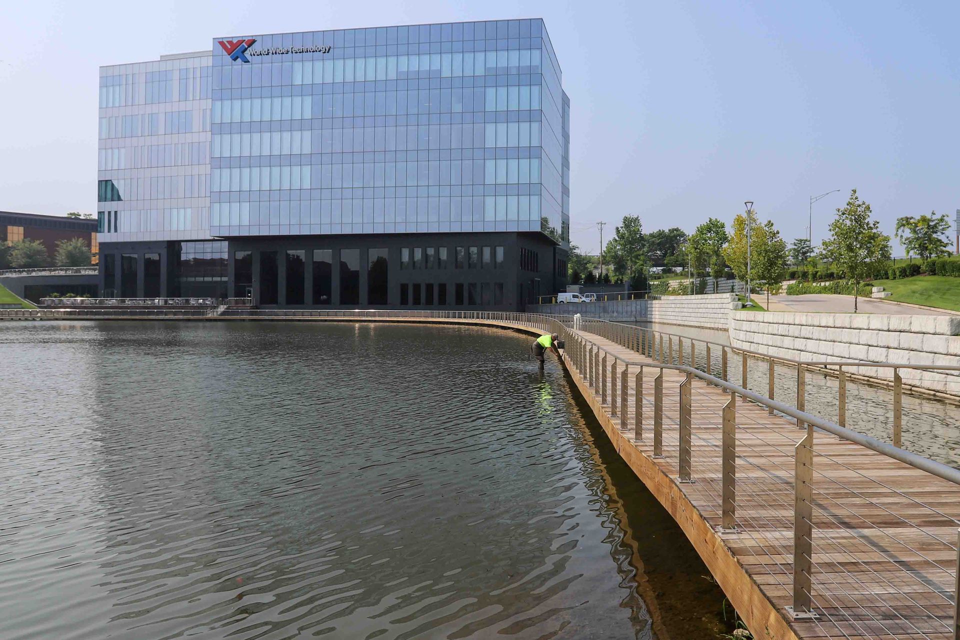
Exterior Color Choices Shape First Impressions
Your building's exterior is often the first interaction someone has with your business. Exterior colors significantly impact curb appeal, visibility, and the professional appearance of your company before anyone walks through the door.
Commercial exteriors benefit from:
- Colors that align with branding
- High-contrast accents for signage and architectural details
- Durable finishes that maintain appearance over time
A well-chosen exterior color scheme can elevate your business's presence and help it stand out for the right reasons.
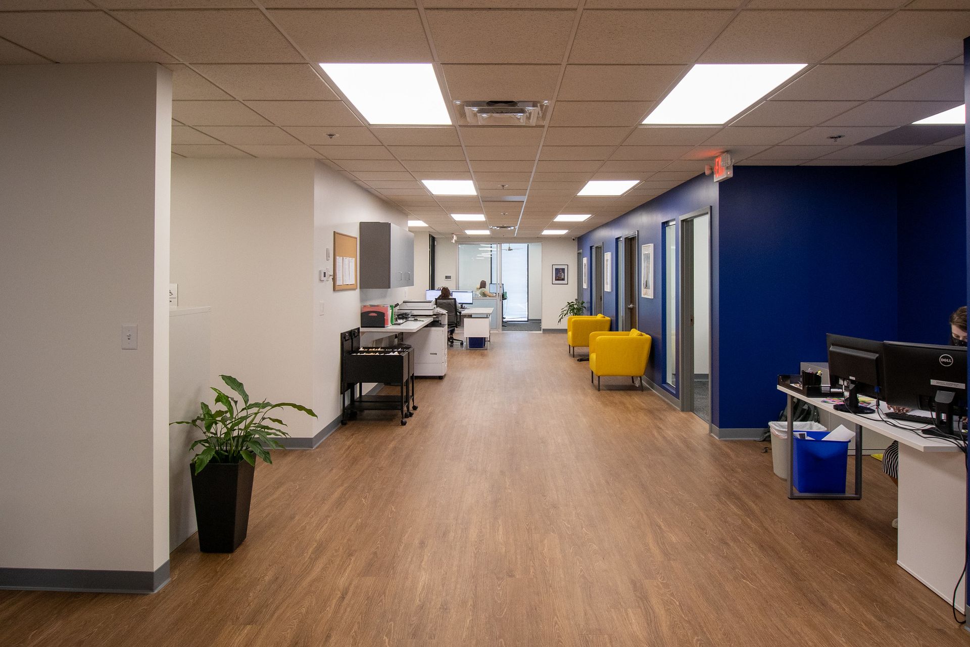
Interior Color Strategy: Supporting Flow and Function
Inside a commercial building, color can be used to define spaces and guide movement.
- Neutral tones in common areas create consistency and cohesion
- Accent colors help distinguish departments or zones
- Softer colors in work areas promote focus, while brighter tones energize collaboration spaces
Consistency across interiors helps reinforce brand identity while improving usability and comfort throughout the building.
Choosing the Right Color Palette for Your Business
Selecting commercial paint colors requires more than personal preference.
- Brand identity: Colors should align with your logo, messaging, and company values.
- Audience: Consider how clients, customers, or patients will feel in the space.
- Lighting: Natural and artificial lighting can dramatically change how a color appears.
- Balance: Bold colors are most effective when paired with neutral foundations.
Testing sample colors in the actual space is essential to ensure the final result meets expectations.
Common Color Mistakes to Avoid
Some of the most frequent issues in commercial painting often involve disregarding basic color theory principles.
- Choosing colors without considering lighting conditions
- Overusing bright or saturated colors in high-traffic areas
- Ignoring long-term maintenance and wear
- Failing to coordinate interior and exterior palettes
Avoiding these pitfalls helps ensure your paint investment delivers lasting value.
Why Professional Commercial Painting Makes a Difference
Color theory is most effective when paired with expert execution. Professional commercial painters understand not only how colors work together, but also how different finishes, surfaces, and applications affect the final result.
Work With SmithPro Commercial Painting
Color is more than decoration; it's a strategic tool. When applied thoughtfully, it can shape perception, improve functionality, and enhance the overall success of your commercial space.
If you're considering a commercial painting project, working with professionals who understand color theory can help you achieve results that not only look great but also perform even better.
Contact us today to learn more about our professional painting services and how we can help bring your vision to life.